 Since 2008 our logo has consisted of a lowercase "i" set within a circle to represent our firm’s holistic approach to brand identity and design. Imagine my surprise, when a couple of years ago I spotted a huge directory sign at the Circular Quay (pronounced “key”) in Sydney, Australia, that had a very similar mark. Not only was the symbol almost identical to Indicia’s, it was placed on a huge orange monument sign (our firm’s color).
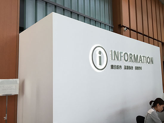
 Originally I blew off the encounter as merely a coincidence. That is, until last month, when I was at Miraikan, the National Museum of Emerging Science and Innovation in Tokyo, Japan. There, at the entrance to the main exhibit hall I observed the Information counter, complete with a backlit sign of an “i” within a circle (just like the one that hangs in our office lobby). Clearly, a lowercase “i” within a circle has come to connote “Information” in many countries throughout the world.
 Curious about when or why this had occurred, I began researching international symbols. In 1974 the American Institute of Graphic Artists (AIGA) and US Department of Transportation created a series of symbols for use at airports and large multinational events such as the Olympics. Universal in meaning, they transcended language and cultural barriers. The original symbol for Information, as defined by the AIGA, was a question mark within circle.
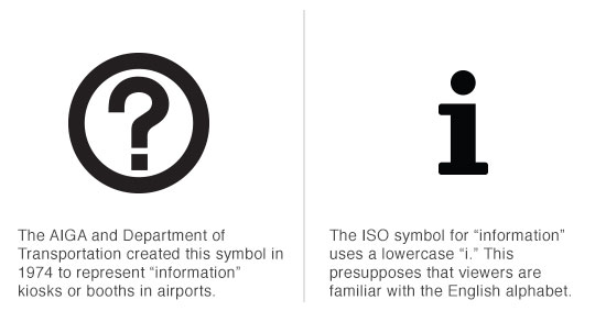 In recent years, the ISO (International Organization of Standards) has also created universal symbols for communication and public information. According to their standards (ISO 7001:2007), an information kiosk or booth should be connoted by a lowercase “i.” More than likely, what has happened is that designers, not fully accepting the mark, have decided to remove the serifs of the “i” (for simplicity and reproduction purposes) and then placed it within a circle so that it stands out more as an icon.
This brings us full circle to my original observation—that Indicia’s logomark, if separated from the company name, could be interpreted (in some countries, at least) to mean “information.” Is this such a bad thing? I don’t think so. After all, we do have all of the information you need on branding and why it’s important. All you have to do is ask.
Consider us the source for information on branding.