“Big Data” pervades every aspect of business management today—everyone is concerned about capturing data: from customer demo- and psychographics to the lifecycle of a product or service. The “Internet of Things,” networked appliances, sensors and gadgets, are all providing real time reporting on everything, creating a tremendous amount of data. The problem is: what do we do with all of this information once we have it?
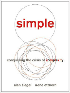 I have written about the importance of infographics in other posts, and how professionally designed visuals can help communicate complex information in more meaningful ways, but since then the problem of too much information has gotten worse. In their book Simple: Conquering the Crisis of Complexity, Alan Siegel and Irene Etzkorn argue that “we need information, but what we’re getting instead is data—untamed and unfiltered, without order, structure, or shape, and ultimately, without meaning.”
In a recent Wall Street Journal article, Susan Credle, a creative director for a global advertising agency, argues for companies to focus more on telling the story of their product or service, instead of simply presenting data about the brand. However, both of these goals may be achieved through the use of professionally designed infographics (information graphics)—and with better success than simply relying on words alone.
The reasons why infographics (visualized data) are better than words is:
1. The brain processes images better than words.
Words can have hidden meaning (especially if you are not familiar with the language) or be interpreted in different ways. This is one of the reasons why communication through email can be misconstrued so easily…without appropriate context, we are not sure of the tone, urgency or mood of the sender. I prefer face-to-face meetings with clients because I am able to not only hear what they are saying, but I can gauge their response through body language.
2. Visual images invite the viewer to interact with the data.
Humans are hard-wired to discover patterns and interpret the world around them, ultimately filling in the blanks and drawing conclusions.
3. Infographics provide context for data by showing relationships, revealing outliers or anomalies, and showing patterns or trends.
“A picture is worth a thousand words” because it can tell the whole story about the data, not just a small part of it. It also makes the information more transparent and understandable.
Businesses are so focused on “numbers,” the “ROI,” and “data,” that we often forget about the audience—the people who actually need to use the information. Having a bunch of information or facts is one thing; having it distilled in a way that is understandable and meaningful is another. Unless people can understand what all of the data means it is, for all intents and purposes, useless. Charles Mingus, a famous jazz musician, is quoted as saying, “making the simple complicated is commonplace; making the complicated simple… that’s creativity.”
A great example of how complex information can be simplified is the updated design for the Nutrition Facts labels, found on over 800,000 food products sold in the U.S., and updated last May. While at first glance the difference between the old and new not be that apparent, key pieces of data have been made larger, bolder, and easier to understand.
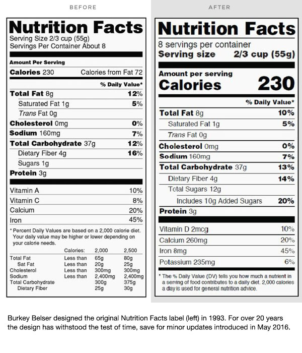
Part of the obesity epidemic in this country is due to people eating too much and not being active enough. The new Nutrition Facts label highlights not only the number of calories in a serving, but how many servings are in a container. For containers that in all likelihood would be consumed in one serving, the new labels show how many total calories are in a package. This might discourage some people from finishing, say, a whole bag of potato chip with their zero calorie diet cola.
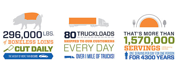
When using infographics, brands can visualize abstract ideas and concepts in a way that will resonate with viewers, helping them better understand the information. However, it is important to not pack too much information into one graphic … too much data creates clutter and confusion. Better to use multiple graphics to tell the story of your product or service’s features and benefits than one poorly designed one, or worse yet, a bunch of bullet point text.
By: Ryan Hembree,
Principal | Brand & Creative Strategy