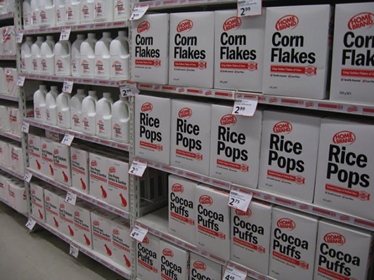
When I think of any private label brand, an ultra-generic package with simple text describing what’s inside often comes to mind. Rice Pops, Corn Flakes, Detergent. Even the names sound generic. No interjection of style, no slick marketing buzz words, and very little thought taken into consideration. Take for example the picture below.
The premise that a store brand has to exude a “cheap” look is broken by a snack artist–one in particular. Appropriately dubbed ‘The Snack Artist,’ Safeway’s private label packaging is quite the opposite of “cheap” or “generic looking.” It is playful, whimsical and unlike many other store brands, actually has some personality.
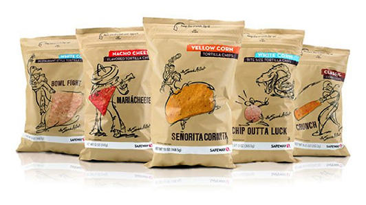
It’s not uncommon for a private label brand to have good design (see Target’s Archer Farms brand), but Safeway’s brand has a different overarching theme with clever names and interesting doodles. Each product has a photo of the enclosed item, placed front and center (and if that is where the design stopped, this article wouldn’t exist). Inked on top of that image (always in black), is an illustration that takes this packaging from bland to flavorful. The illustration style has much personality with thick and thin lines, and the interaction between photo-realistic and illustration adds to the personality. There is a nice balance between illustration and product image–giving a glimpse into a deeper story.
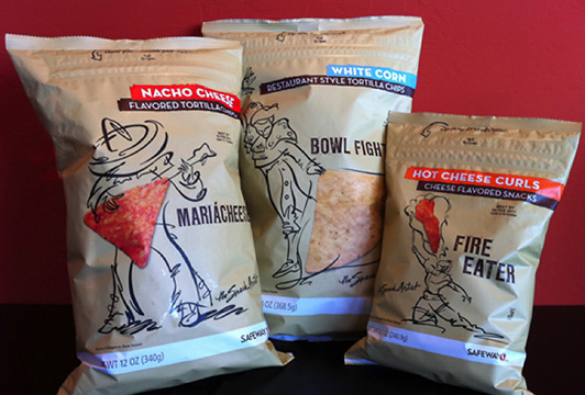
The naming goes hand in hand with the illustration: “Mariacheese” next to an Amigo using a triangle-shaped Nacho Cheese Tortilla Chip as a musical instrument is perfectly executed. The front center does not feature the name of the item, and I couldn’t be more delighted. There is something to be said for letting the image and illustration elements take the main stage of each package and creating an interaction between the buyer and the package.
The personality is written (or drawn) all over the package, and all of this personality makes me think I am buying something more unique, not just a pre-boxed food item—something that could be framed and hung on a wall. And at a much lower cost than a large brand, this is a huge benefit, making this a win/win for both Safeway and the customer.
By: Justin Leatherman, Art Director