As someone who frequents the hardware store, walking through the aisles of tools and gadgets making imaginary wish lists, Stanley has become a part of my DIY vocabulary. Established in 1857, Stanley has withstood the test of time by evolving with the industry, continuing to produce quality products. Recently, the brand merged with Black & Decker, creating Stanley Black & Decker. This has carried them in to a new realm, from Healthcare and Security products to Engineered Fastening and Oil Pipeline Services. As any S&P 500 company would do in this situation, they decided to update their branding.
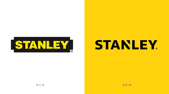
Partnering with Lippincott, a global brand strategy and design firm, Stanley worked extensively with all touch points of the brand to preserve its essence. Keeping the signature black and yellow color palette, Lippincott freed the Stanley logotype from the black badge-shaped enclosure, instantly modernizing the logo. Changing the typeface from stout and bold to slightly taller and less heavy was another choice that seemed to update the look. The “N” is cut diagonally, leaving a right triangle pointing upwards. At first look, I think of a square tool, communicating a theme of precision.
In their press release, Stanley describes the arrow as representing “action”, which seems to have been chosen directly from a generic word library for logo meanings. I’ll give them the benefit of the doubt and stick with the square tool idea. Besides the “N,” there is the incredibly strange “S” at the front of Stanley. The awkwardly angled end, or terminal, of the “S” runs directly in to a perfectly square bar on the “T.” This detracts from the intention of the precise arrow. It may be nit-picky, but in contrast to the previous “S,” which curved around to end parallel to the baseline, the new “S” seems like a mistake. I don’t love it, but all in all, I can live with wonky “S” and appreciate the reminder to measure twice, and cut once.
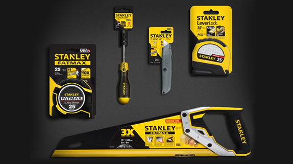
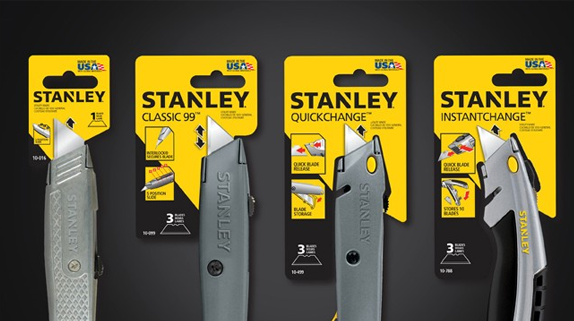
Next, Stanley has revamped all of their packaging to include the new look. The products have a strong look with the clean, new logotype applied. However, the actual packaging uses the logo so large that it starts to seem more like a generic “house” brand of a chain store. In my opinion, using the logotype smaller, left-aligned on the packaging could give it a more premium feel. Large and centered seems cheaper than the Stanley name deserves. It may take until the final product reaches the shelves to get a good impression of the new packaging, but for now, I will have to hope that the design gets a few updates.
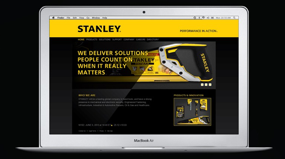

Overall, I applaud Stanley Black & Decker for updating the logo, going for a slightly modernized approach but still keeping things simple. The black and yellow color scheme has become well recognized and will continue to do so. “I believe that this new logo has the strength and power to carry us for decades to come”, said Scott Bannell, Vice President of Corporate Brand Management. This may be correct, especially with Stanley’s history of consistency. The new logotype will look fantastic embossed directly on to metal or printed on Stanley’s tools, as well as on the vast array of products the newly formed corporation will deliver. Until then, I can live with the “S” and generic packaging, and appreciate the presence of fresh design in the hardware store.
By: Neil Ryan, Art Director