
In early September, Sprint and Nextel completed a multi-billion dollar merger and launched a new Sprint brand. How does this new brand stack up against other cellular phone companies?
![]() At first, this critic was very skeptical of the new Sprint brand. After all, the red diamond mark had been around since the late 1980s, when United Telecom merged with Sprint to form US Sprint (which eventually dropped the “US” part of its moniker in the 90’s). That logo was the perfect marriage of those two companies’ identities, as it incorporated a rotated square, taken from United Telecom’s keypad logo, and the tapered lines of Sprint. The typeface was changed from Helvetica (modernist aesthetic) to a more friendly Serif typeface.
At first, this critic was very skeptical of the new Sprint brand. After all, the red diamond mark had been around since the late 1980s, when United Telecom merged with Sprint to form US Sprint (which eventually dropped the “US” part of its moniker in the 90’s). That logo was the perfect marriage of those two companies’ identities, as it incorporated a rotated square, taken from United Telecom’s keypad logo, and the tapered lines of Sprint. The typeface was changed from Helvetica (modernist aesthetic) to a more friendly Serif typeface.
![]() The new Sprint Nextel logo is a logical evolution of the brand as it incorporates a similar sans serif typeface as Nextel (in title case, which is easier to read at small sizes), and is placed on a yellow background. The new Sprint Nextel mark is also a dynamic mixture of Sprint’s former tapered lines and the vertical bar that has become associated with Nextel’s walkie-talkie like capabilities. The new mark resembles both wings (suggestive of flight) as well as a forward pointing arrow. In television the mark is animated to suggest the bounce of a pin, which has been a Sprint signature for years.
The new Sprint Nextel logo is a logical evolution of the brand as it incorporates a similar sans serif typeface as Nextel (in title case, which is easier to read at small sizes), and is placed on a yellow background. The new Sprint Nextel mark is also a dynamic mixture of Sprint’s former tapered lines and the vertical bar that has become associated with Nextel’s walkie-talkie like capabilities. The new mark resembles both wings (suggestive of flight) as well as a forward pointing arrow. In television the mark is animated to suggest the bounce of a pin, which has been a Sprint signature for years.
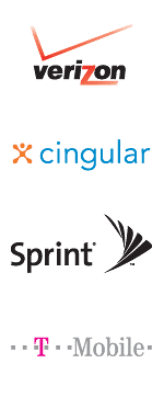 While there are several good attributes of the new mark, this is not to say that the new logo is without a need for some improvement. While yellow and black is a color combination that Sprint can “own” in the cellular market category (much like Coca Cola owns red in soft drinks or UPS owns brown in shipping), it may be overbearing and tiresome if too much yellow is used. It will certainly will grab people’s attention, however, and does stand out from other wireless service providers (see example to the right).
The typeface used for the logo is perhaps a little generic, as there is nothing to make it distinctive from other sans serif fonts. Additionally, there is too much space between the logotype and the mark itself. One might wonder how much more effective the brand would be if the two parts were more integrated together.
The effectiveness of a brand or logo is only as good as the way in which the audience perceives the companies they represent. If the new Sprint lives up to the promises it makes consumers, than the new mark will be associated with positive feelings and emotions about the brand. If it fails to deliver on those promises, however, then the brand may decline; but not for lack of a well designed or appropriate mark. Only time will tell how the new Sprint brand is received by employees and customers of both Sprint and Nextel.
By: Ryan Hembree