Sunglass Hut International, a purveyor of fashionable sunglasses and eyewear, is in the midst of rolling out a new brand identity to its 1,500 retail stores located in malls and other high-density retail areas around the globe. The new identity, developed by everyone’s favorite, Wolff Olins and retail specialist FRCH Cincinnati, has already been unveiled in Europe, and is only now just starting to make its public debut here in the United States, replacing an interim identity plaguing some applications, like the web site. The result has been a confusing image for an iconic sunglass retailer — one that is not nearly as distinctive as the one that it replaces.
One simply needs to visit the retailer’s European website and then the North American version, to see how confusing the Sunglass Hut identity has become. When Sunglass Hut was acquired by the Italian company Luxottica, which owns and licenses several premium and luxury sunglass brands, the identity underwent an overhaul, perhaps to match the other brands within the company’s portfolio. The result was a poorly executed, confusing logotype that baffled not only customers, but employees of the company as well. Sunglass Hut International became “SGH,” set in some custom Eurostile Extended-like lettering, with “sunglass hut” set in lowercase in a geometric sans underneath — definitely nothing to write home about.
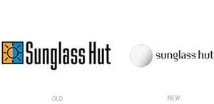
The final redesigned identity is composed of a simple, silvery circle mark that resembles a tinted optical lens, with all lowercase letters set in a unique, albeit very trendy typeface — that actually looks an awful lot like Kate Moss’ typeface. While the silver and black color scheme connotes premium quality and is representative of the luxury sunglass brands the store sells, what appears to be missing is reference to sunlight, which is something that the old mark communicated very well.
The original Sunglass Hut International logo was not a complete travesty — after all, it helped catapult the retail chain into an icon within the industry. The yellow and blue mark, with an abstract sun and ultra condensed typeface, simply and effectively communicated the essence of the brand: selling protective eyewear. When the company decided to sell watches within some of its retail stores and at stand-alone kiosks, it adapted its successful identity to the Watch Station brand by simply changing the sun to a watch face, and replacing the name in the same typeface. In this way, the old identity became a victim of its own success.
What makes the “new” new identity for Sunglass Hut (a la Wolff Olins) so bad is that it doesn’t retain any of the quirky or personable characteristics that made the original one so successful. In their quest to create a luxury, premium brand, the designers instead created one that appears cold, lifeless, and very trendy. Add in the fact that the new brand is being rolled out at separate times and in different geographic areas, this is one brand update that needs some definite clarity.
—Ryan Hembree, principal/creative director (originally appeared on Underconsideration.com/BrandNew)