Although the general election of the next President of the United States is more than one year away, candidates are already blazing trails across the country on tour buses with an army of staff and legions of supporters. Also in tow are terribly designed graphics, banners and signs, all meant to appeal to and resonate with the American public. The question is, do these graphics have to be so bad? Why don’t political candidates learn the lesson that most businesses have, which is that “good design sells”? It seems that most politicians, and the designers who create their campaign logos and graphics, are stuck in a rut.
A comparison of most political graphic design will result in the following conclusions: that in order to look more “patriotic,” one must use red, white and blue; incorporate stars and stripes; and even throw in a donkey or elephant to make sure that people associate the candidate with the appropriate political party. Color is particularly important in politics as well: People tend to identify themselves with either “blue states,” for the Democratic Party, or with “red states” if they are Republican. This has not always been the case.
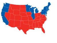 Political party color-coding has been directly influenced by the media, and even reversed from its original meaning—before the 1996 Presidential Election, blue states were used to denote states in which the incumbent presidential candidate had won all of that state’s electoral votes; the red state designation was for those states won by the challenger. Ever since Bill Clinton, an incumbent, won re-election in 1996, blue states have been associated with the Democratic Party by the media and now the general public.
 The campaign graphics for the 2008 Presidential campaign have improved dramatically since the last election, in which John Kerry and John Edwards faced off against the incumbent George W. Bush and Dick Cheney. Each of those two campaigns used white text on a dark blue background, combined with a waving American flag to communicate how “patriotic” each candidate was. The only differentiation one could make between the two, if you had no idea what their political party affiliation was (or you lived in a vacuum), is that Kerry used a serif typeface (more personable, friendly) combined with the tagline “A Stronger America,” while Bush used bold, sans serif type that is suggestive of strength and solidarity.
 Of the Democratic front-runners, the only campaign graphics that stands out is that of Barack Obama, whose “O” logo incorporates a striped valley in front of what resembles a rising sun, suggesting a new dawn in politics. Hillary Clinton’s campaign logo looks like it was created by the same designer as John Kerry’s, complete with the same typface and a compressed flag underneath. She has even attempted to “brand” herself as simply “Hillary” so that she is not as closely related to her husband, Bill Clinton. And while John Edwards has attempted to break the mold with a modern typeface, the rest of the graphics are cliché, with a star and green swoosh trailing behind it (is this his attempt at appealing to all aspects of society; the blue states, the red states, and even the green environmentalists?)

 The Republican presidential candidates have not done much better in creating unique and memorable graphics for their candidates. The one that stands out the most is that of John McCain, as he has veered away from the use of traditional blue and red colors and drawn upon graphic references to his military record—the black and yellow color scheme resembles a Naval officer’s uniform. Rudy Guliani’s graphics are simple and effective, as most of American refers to him as “Rudy,” while the simplicity of Mitt Romney’s elegant typeface stand out on a navy blue field.
 Only time will tell if the much improved, yet still lagging, political graphic design of the current presidential campaign will help propel one of the candidates through the primary, and then finally to the general election in November 2008. One thing for certain is that the new visual standards set by these campaigns is slowly helping to raise the bar of what John-Q-Public expects of graphic design.
By: Ryan Hembree
Only time will tell if the much improved, yet still lagging, political graphic design of the current presidential campaign will help propel one of the candidates through the primary, and then finally to the general election in November 2008. One thing for certain is that the new visual standards set by these campaigns is slowly helping to raise the bar of what John-Q-Public expects of graphic design.
By: Ryan Hembree