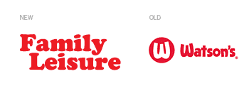
This past February, Watson’s, the largest leisure product retailer in the United States (according to the company’s web site) launched a re-brand to reflect the changing focus of their products and service by becoming the Family Leisure brand—“Where fun and family come together!” Since the company sells more than pools, spas and tanning beds, (including pool tables, game tables, bar stools, bars, and patio furniture), the new name is meant to suggest an expanding line of leisure products. However, not only is the new name overly generic and uninspiring, it seems entirely unnecessary.
Over the last 15 years, Watson’s had built valuable brand equity through its distinct, albeit annoying, television commercials. Featuring Jennifer “the Watson’s Girl” Foley and her step-father as spokespeople for the brand, the immediately recognizable and highly memorable spots always closed with the tagline “That’s Watson’s!” The old Watson’s brand was simple, unique and memorable, consisting of a hand-rendered script set beside a “W” within a red circle. The new brand, “Family Leisure” is set in Cooper Black type, a font that was over-used on packaged goods in the late 1970s and 80s, and immediately dates the mark. It is neither forward-thinking or nostalgic in execution.
Consistency is lacking in the launch of the new brand, and the messages that are being communicated are contradictory: in explaining the name change, the website touts that the products it sells are for a “family-focused leisure lifestyle,” yet a few paragraphs later describes the company as “a toy store for adults.” When I think of an adult toy store, I think of something entirely different than a wholesome family environment. Additionally, not all Watson’s stores have transitioned to the new brand, and there are still two web domains users can go to online, Watsons.com and FamilyLeisure.com. Both utilize the same cold and impersonal look and feel. In some cases, the red “W” mark is used with the new store name (as seen in this 4th of July promotion).
So what should Watson’s have done to help communicate the shifting focus of their product line? What was needed was more of an evolution of their existing brand, not a complete revolution and name change. Most retail brands change their look every couple of years in order to stay relevant in the minds of consumers. Perhaps a simple change in Watson’s tagline or a revitalized positioning statement would have been a better course of action. Even “Watson’s Family Leisure” would have been a better change to make.
Only time will tell if the new Family Leisure will be a successful brand, or if it will fade into obscurity. Watson’s was at least memorable and unique. This name change has essentially forced the 40 year-old company to start over in terms of brand equity and customer perception.
—Ryan Hembree, principal/creative director