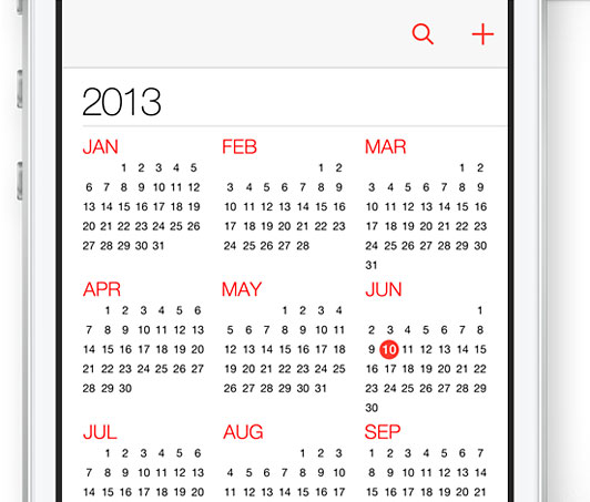
Get ready for a new feel when you touch your iDevice. Well, not a literal sensory feel, but a visual feel. You’ll still be touching a high-quality glass screen, but what’s underneath is getting a makeover. I’m talking about the iOS 7 icons, Apple’s new iDevice operating system. No more ultra glossy icons to tap; at least after you install the update. Apple is rolling out its new iOS 7 look in the fall of 2013, and this will the first major update since 2007.
While first getting some criticism for not releasing a new iPhone at the WWDC (Apple Worldwide Developers’ Conference) in June, they did unveil a completely new iOS 7 operating system. Why the update? Apple says, “…Our purpose was to create an experience that was simpler, more useful, and more enjoyable — while building on the things people love about iOS. Ultimately, redesigning the way it works led us to redesign the way it looks.”
So what’s the difference? What’s new? The most noticeable ![]() change is the gloss-less look (applause sign please). Icons for apps no longer have an overly cheesy, “trying to make 2-D look 3-D” kind of dimensionality. They are now donned with ultra bright colors and subtle gradients. The rounded corners are now more round, and each icon uses a slightly lighter weight typeface (Helvetica of course).
change is the gloss-less look (applause sign please). Icons for apps no longer have an overly cheesy, “trying to make 2-D look 3-D” kind of dimensionality. They are now donned with ultra bright colors and subtle gradients. The rounded corners are now more round, and each icon uses a slightly lighter weight typeface (Helvetica of course).
Do people like it? After all, the masses will be using it. Despite the heckling coming from the haters, most users polled prefer the new iOS 7 icon design to iOS 6. According to Polar, a mobile polling tool built by Input Factory to gauge user opinions, users prefer the new look and feel two to one, with over 46,000 people answering. However, the complaining has not ceased. Some are calling the complete design ‘hideously ugly,’ but I don’t agree.
In my opinion, the design has been long overdue. I enjoy the brighter colors and flatter look of the icons. It exudes sophistication while also feeling like a consumer device. It’s apparent that more focus is devoted to typography and simplicity, making for a clearer user experience. Are there things I would change? Yes, but they are small: make the corners more square and maybe reduce the saturation of the eye-popping colors.

In order to justify the cost of a high-end device that makes calls and does a thousand other tasks, the user experience needs to look sexy and expensive–and that goes further than the encasement. Many users are so used to the previous look that I think for some, the disdain is a knee-jerk reaction. Will the redesign mean a few less sales of iPhones? Perhaps. But I think the redesign will eventually be embraced. After all, Apple is trying to give users something they don’t realize they want, which is not an easy thing to do.
Sometimes it is necessary to do a little “spring cleaning” and de-clutter, even when you don’t think you do. That’s what Apple has done with iOS 7. In their own words, Apple says they made the new look and feel to “work and look beautifully.” I agree.
By: Justin Leatherman, Art Director