 In early July, Starbucks introduced newly repackaged organic boxed milk in its stores. The old Horizons brand with its leaping cow, has been replaced by a Starbucks design and branded container featuring bold colors, simple graphics, and the iconic green straw.
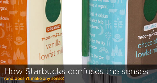
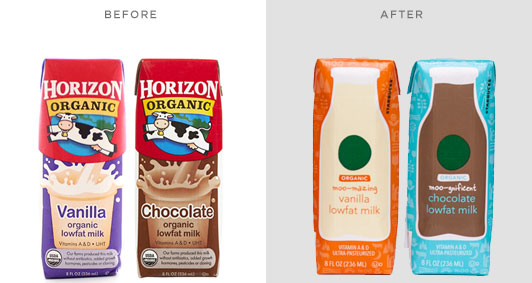 The new Starbucks milk packaging is simple yet whimsical, with a flood of bold color and subtle pattern of farm-related symbols. A large, old-fashioned milk bottle appears on the front, with a green circle (a simplified Starbucks logo?) and a playful attempt at naming the product: “moo-gnificent chocolate” and “moo-mazing vanilla.” The brand story appears on the side in a hand-written typeface. Overall, the design of these packages is well done. The problem, and what is most disconcerting, is the choice of colors used goes against all conventional wisdom (and proven research) regarding brand packaging, making the product a lot less appealing, and appetizing, to buy.
 When Coke introduced their white Polar Bear cans for Christmas 2011 (read more about this), not only did customers have difficulty finding the product on store shelves, they also complained that it tasted more like Diet Coke (presumably because the can looked similar).
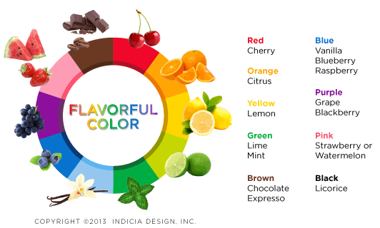 Color has the power to affect how we perceive something to taste—which is why it is so important in food and beverage packaging. Common color and flavor associations have been completely disregarded by the Starbucks milk packs--the Vanilla-flavored milk should have used the baby blue carton; instead, the flood of orange makes it look more suitable for orange juice or Tang. And while Starbucks uses a lot of brown throughout its stores and brand, that color would have been much more appropriate for the chocolate milk carton. It is almost as if differentiation instead of communication was the goal of the color schemes.
So what can be learned from Starbucks’ fruity-looking milk cartons? First, no matter how beautiful a design is, if a package gives off the wrong impression about the brand or product, then it will not resonate with consumers (and possibly hurt sales). Secondly, color should be used for effectively communicating a product’s attributes, not simply as a means to differentiate. Only time will tell if Starbucks customers will find the new packages relevant (or appetizing).
By: Ryan Hembree, Principal | Brand & Creative Strategy
Color has the power to affect how we perceive something to taste—which is why it is so important in food and beverage packaging. Common color and flavor associations have been completely disregarded by the Starbucks milk packs--the Vanilla-flavored milk should have used the baby blue carton; instead, the flood of orange makes it look more suitable for orange juice or Tang. And while Starbucks uses a lot of brown throughout its stores and brand, that color would have been much more appropriate for the chocolate milk carton. It is almost as if differentiation instead of communication was the goal of the color schemes.
So what can be learned from Starbucks’ fruity-looking milk cartons? First, no matter how beautiful a design is, if a package gives off the wrong impression about the brand or product, then it will not resonate with consumers (and possibly hurt sales). Secondly, color should be used for effectively communicating a product’s attributes, not simply as a means to differentiate. Only time will tell if Starbucks customers will find the new packages relevant (or appetizing).
By: Ryan Hembree, Principal | Brand & Creative Strategy