The World Champion Kansas City Royals made their Opening Day debut last weekend against the New York Mets. In the first game of the series and season, everything about it seemed like a continuation of the World Series, from the sold out crowd clad in royal blue to the pitching match ups.
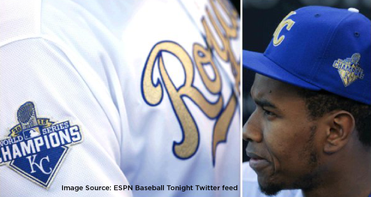
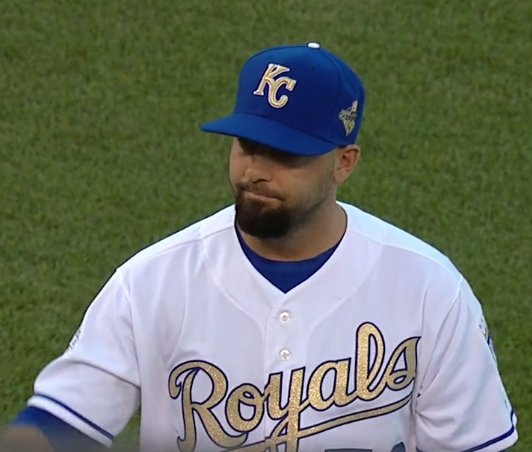
One thing that was different, and immediately noticeable, was the Royals’ gold adorned uniform. The Royals script, normally blue, is a shiny metallic gold, as are the player numbers on the back. Topping it all off, a gold stitched “KC” and World Champion logo is embroidered on the caps. Is all of this shiny gold necessary? I get the idea that the Royals are the “kings” of baseball right now (as World Series champs), and that the name itself connotes “royalty,” but is this going a little too far with the brand? One of the things I love best about the Royals, and Kansas City in general, is the humbleness and Midwestern qualities they possess.
Don’t get me wrong, the Royals (and their fans) have every right to be proud of what they have accomplished over the past couple of years. My concern is that all the gold bling may be a little too gaudy and showy, and contradict people’s perceptions of the brand.
Or, are the gold uniforms a ploy to distract opponents? In college athletics, Oregon and Baylor have donned brightly colored neon uniforms to great effect. In the movie Catch Me if You Can, Frank Abignale, Jr., makes a similar observation: “You know why the Yankees always win, Carl? …it’s ‘cause the other teams can’t stop staring at those damn pinstripes.” Perhaps all of the glittery gold will be like the Yankee’s pinstripes, and keep the Royals winning.
By: Ryan Hembree, Principal | Brand & Creative Strategy