“It was the best of times, it was the worst of times.” This opening line from Charles Dicken’s immortal classic, A Tale of Two Cities, could very easily be adapted to describe “A Tale of Two Companies,” and their current national marketing campaigns that are being broadcast on television, billboards and in print. One is the highly effective XM Satellite Radio campaign; the other is Sprint’s new “Sprint Ahead” marketing campaign.
 “It was the best of campaigns…”
For a brand awareness campaign, they don’t get much better than the current “Are You On?” campaign that was developed by Lowe New York for XM Satellite Radio. While some may say that there are sexual undertones to this campaigns (“170 channels to find what turns you on”), I think that they are missing the whole point of this campaign—it is not about sex, rather, it is about finding music or programming that anyone can enjoy, from punk rock to classical music to sports.
What makes this campaign stand out is the simplicity of its execution. Because of the style in which it is rendered (white line drawings on flat black backgrounds) it stands out from most of the advertising clutter that bombards viewers daily (on average we are exposed to thousands of visual messages every day, all vying for our attention). The only color that appears on each billboard, print ad or television commercial is the yellow XM “signal” used in a very dynamic way—it becomes Beethoven’s flowing hair, forms a mustache for a Nascar lover, and a flame that lifts a hot air balloon.
Each use of the logo mark is so expressive and memorable (particularly the animated television spots, which feature a corresponding soundtrack), that it demands the viewer to pause and take notice of the ad. Once that initial hook has been made, the message of “something for everybody” is creatively conveyed using simple illustration and minimal use of words. Furthermore, this concept has infinite possibilities for execution, meaning it can be expanded on for years to come. The last great campaign, in the opinion of this critic of course, which offered the same possibility was the Absolut Vodka ads of the late 1980’s and 90’s (Absolut “noun, name, place, etc.”).

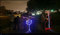
Since completing its merger with Nextel nearly two years ago, Sprint has struggled to find its voice through marketing and advertising campaigns, losing millions of customers because of it. First, there were the big yellow billboards that introduced us to “Sprint: Together with Nextel”, then there was the Ron Livingston character in the “Power Up” campaign. Now, there is the “Sprint Ahead” campaign, featuring neon-like streaks of light that form juvenile looking drawings of rocket ships, flowers, and pie charts.
While a clever use of time-lapse photography, these new ads contain too many different messages that may confuse potential customers. “Experience Life at Sprint Speed,” “Taking Care of Business at the Speed of Light,” and of course, “Sprint Ahead.” And then, according to Tim Kelly, Sprint’s Chief Marketing Officer, the whole idea of the ads is “to portray Sprint’s mobile phones as ‘magic screens’ providing an on-the-go consumer with pictures, music and communications tools.” The whole speed of light concept I get, but “magic screens”? That seems to be a bit of a stretch. After all, in each of the ads I can barely make out the phones that are used to create the light drawings (if in fact, that is how they were made).
At one time Sprint had one of the most recognizable marketing campaigns, featuring the memorable “Sprint Guy.” Women loved him and business people could relate to him. Ever since the merger with Nextel, however, the company has had one identity crisis after another—first changing its color scheme from red and gray to yellow and black (and we mean a lot of yellow), then with large billboards of yellow that had taglines such as “Power Up” and “Together with Nextel.” Not only do these new ads eliminate the obnoxiously loud yellow backgrounds (the rationale here was solid: black on yellow is the most visible color combination, however, if it is used too much, it is very fatiguing), they also remove any ties to Nextel. Perhaps this campaign, like Nextel, will fade into oblivion over time.