Ruby Tuesday, the international restaurant chain known for its casual dining menu and impressive salad bar, has been implementing a new, “fresh” (a word emphasized over and over) identity over the past several months to coincide with an update of the brand’s interior. Gone are black- and white- checkered tablecloths and the hodge-podge of sports memorabilia that adorned the walls and were reminiscent of Applebee’s or TGI Friday’s In their place is a more upscale and elegant look and feel.
For the most part, I am impressed with the work of DJ Stout and team from Pentagram, Austin. The new identity represents a more sophisticated eating establishment, and features some great brand extensions, such as the “RubyTueGo” take out service. While the green used on the RubyTueGo cups, billboards and bags are a little garish for my taste, they effectively communicate the idea of freshness. The burgundy, though not much different from the old, is warm and inviting.
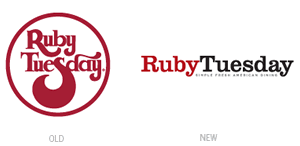
RubyTuesday’s new logotype is set in Clarendon, a nice, slab typeface that feels somewhat contemporary yet friendly and approachable. Unfortunately, I think that the designers missed the opportunity to add some sort of embellishment to make it more unique—some minor tweaks could have also resolved the unusual kerning between the T and u of “Tuesday.” As bad and over-the-top as the old logo was, at least there were decorative touches to the tail of the R and S, as well as the ascender of the D—these resembled steam, suggesting good things to eat and making it more memorable.
In reading the Pentagrams’ blog and the description of the project, you would think that they were so proud of themselves for coming up with the idea of merging the restaurant name into one word… according to DJ Stout, “The idea of running the words ‘Ruby’ and ‘Tuesday’ together in the logotype came to me one day when I was sitting in the reception area… waiting for a meeting. I overheard the operators answering the phones and they would routinely refer to the company as “RubyTuesday’ as if it was one word instead of a two word name.”
Well, excuse me, but duh! I have always called the restaurant RubyTuesday, not Ruby [pause] Tuesday, or simply “Ruby,” or even “Tuesday” for that matter. What is interesting to point out is that on the restaurant’s signage (mock up shown on the Pentagram blog), the logotype does not run together to form one word, with Ruby being stacked on top of Tuesday — so much for the one-word ingenuity. Obviously the new identity has some limitations due to its horizontal nature.
And speaking of signage, you might have noticed in the Fresh Look link from the first paragraph that another logo — not the old foxy one, nor the new one — adorns the façade. Somewhere in between the new and the old, this logo made a brief and confusing appearance online and on TV ads. So, perhaps not the smoothest of transitions for Ruby Tuesday. Overall, there are very few things that I can find fault with in this new Ruby Tuesday identity. Pentagram’s “simple” and “fresh” perspective has elevated the sophistication of the brand and added a little more “snob appeal” to a chain known for its casual, affordable menu.
—Ryan Hembree, principal/creative director (originally posted on Underconsideration.com/BrandNew)