Many people might not care about getting a slick, modern-looking box of dryer sheets when shopping…I’m more of a bargain shopper myself. The new identity and Bounce brand packaging however, compelled me to not only think more about my dryer sheets, but to also probe deeper into the redesign of this iconic brand.
At first glance, I really enjoy the new look and experience very little disconnect between the old, established look that the product has had for years. It has some elements that work quite well, allowing it to stand out from other, orange, competitors on the store shelf, while others leave me questioning whether the re-brand really matters.
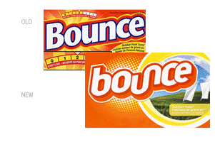
The more I look at the design, the more I think we could easily be examining a rejected chewing gum package that was resurrected to become the new “rock star” of the dryer sheets aisle. For example, the minimalist approach to the package design is quite refreshing—by removing the blue call-out window and charts that used to live on the front of the box, the result is a much cleaner composition.
Photos and color are used to differentiate between the various types of dryer sheets. I also like the halftone pattern that has replaced the old sunrise motif. I do like that the new product logo is more “bouncy” than that of the original. The lowercase “b” and ligature between the “u” and “n” makes sense, suggesting the swirling path this product travels while in the dryer.
Both the front panel graphics and type treatments could have more depth to them, as it looks a little flat. Perhaps bringing back the blue outline around the type or adding a drop shadow to the white border would do the trick.
I am curious about Procter & Gamble’s motivations—was one of the objectives to reach a younger audience? Is that demographic doing more laundry these days, feeling the need to be “cool” while they throw the whites into the dryer? This might explain the new type treatment of the logo. While I understand wanting to be hip when dealing with electronic products or junior wear, perhaps this tactic is too much for the laundry aisle. Overall, however, I think that the new package design is very effective at “bouncing” into shoppers’ field of vision and subsequently off the shelf.
By: Chad Wagner, designer