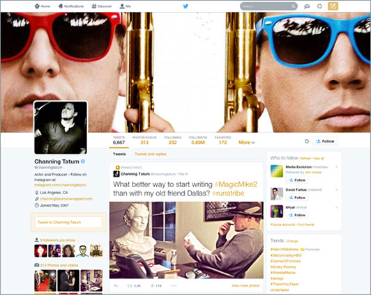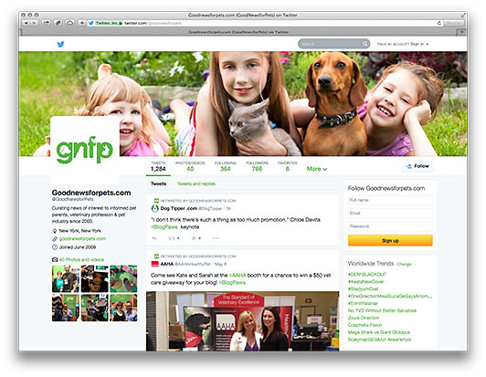
Last month Twitter announced photo tagging and the ability to upload up to four photos to a tweet. In a continued effort to move away from the straight text filled timeline, Twitter announced a complete redesign of their profile pages on their official blog last month.
The new design takes a few visual cues Facebook and it all starts at the top. Your profile now has a large header image that expands the width of the browser window. This goes along with a profile photo that is layered above the left column and the cover image. Stuck to the header image you’ll see the common Twitter navigation items with their respective counts; including Following, Followers and a large ‘Follow’ button. The individual details for the profile, including bio, location and website, appear move to the left column under the profile photo. Rounding out the left column we have links to Photos/Videos and the shared followers with the user.
Tweets take center stage as the main column contains the main feed. Along the top of the feed you get two tabs to flip between: “Tweets” and “Tweets with Replies,” highlighting how users interact with each other within the Twitter world. Using the new Facebook Newsfeed as a reference, tweets that contain Videos and Photos now show a large preview within the timeline. Showing videos/photos in the feed keeps the user engaged with visual content without leaving the feed.


The timeline also has two new features that are worth highlighting. First is the ability to pin a tweet to the top of the timeline. This allows users to highlight a specific announcement or information without having to retweet it every 2 hours; Fast Company points out that “this acts as almost a supplement to your bio: while the latter tells people information about you, the pinned tweet is a snapshot of what you’re all about now”. The other feature is the appearance of “Most Popular” tweets in a timeline. Twitter has always tracked tweets and shown the number of interactions they received. Now, they are using those stats to display the most favorite and retweeted posts, with a larger font size.
Personally, I am not a big fan of the new navigation below the header image when it sticks below the main navigation (fixed at the top of the window) as you scroll down the timeline. It is really strange that there is a gap in between the navigation bars—it looks more like a mistake than anything else. I would have preferred to have those links fixed along the left or right sidebar to clean up the header area as you scroll down. Another interesting issue that some of our clients have experienced is that it is no longer possible to add photos or patterns to the background of a Twitter page—instead users are limited to selecting solid colors only. This is meant to avoid distracting from the twitter feed, but some users will miss this feature.

Overall, it is a fantastic redesign. It shows that Twitter believes visual content is very important to its future, while showcasing Twitter as a user-friendly platform to new users. Detractors will point out that the new profiles are similar to Facebook; but this doesn’t take away from the fact that the cleaner, more visually engaging layout is a sure winner for Twitter.
By: Emilio Servigon, Web Designer & Developer