The Tea in your cup might not be changing, but the letter T on your cup will be. Tazo Tea has quietly introduced a new look to their packaging and overall branding.
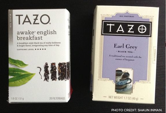
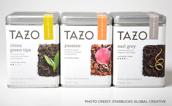
At first sip, the brands look quite different. It seems that the main objective was to polish up the look making it more presentable with a cleaner typeface, brighter colors, and an overall more modern feel. The teabag shape wasn’t reinvented and the name hasn’t changed—Tazo has just turned over a new leaf.
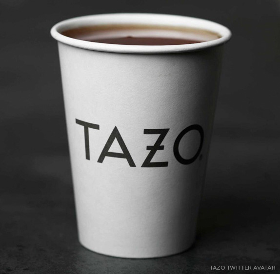
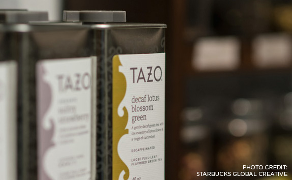
Although the visuals are different, there are a few things that remain constant. The logo itself carries a strikethrough in the letter Z, consistent with the previous logo. This alone gives it a “I am the same, but I’ve graduated” look. Daniele Monti, Creative Director at Starbucks Global Creative, said one of the goals was to “…bring the brand into the 21st century, and not to lose its soul.”
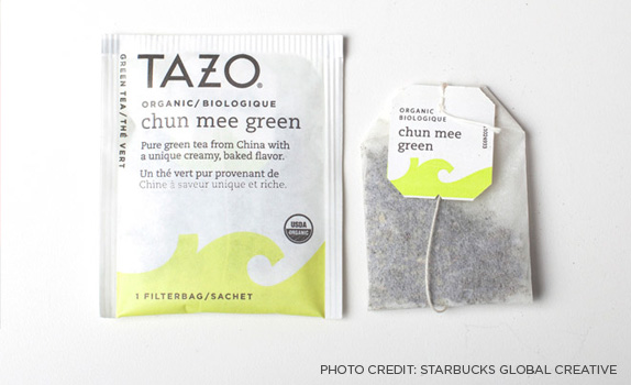
One way this was achieved was with the clever lines of text on the packaging. The old packaging had a mystic feel with the text. It reads, “Tazo happens when one combines amazingly flavorful teas with a fertile imagination and some other good things from nature.” In contrast, the new brand uses humor and wit to describe the tea flavors. “New white tea buds in the splendor of youth swing from the branch of an apricot tree, giggling delicately in the sweet-fruited air. Tahitian vanilla dances and twirls in creamy intoxication.” These new quips help describe the explosion of ingredients blended, which is what Tazo is known for.
The old logo and branding has been largely unchanged since Starbucks purchased the brand in 1999. I’ll be honest, the old look didn’t really bother me. It was strikingly odd, but seemed to fit the world of tea. It was dark, gothic, and felt like it belonged at a Cirque du Soleil performance. It’s exactly what I pictured when I thought of a typical tea drinker–intriguing and mysterious.
In my opinion, a typical tea drinker has an arrogance about their decision to drink tea over coffee. It seems like they think they are making a much more healthy choice and they should be joined by the nearest intellectual to speak of intellectual things (which usually means they say normal things and stare off into space while saying them slowly). So, tailoring a look all on its own for this niche market seemed to work, propelling the Tazo tea drinker to think they were unique and different.
Overall the new brand seems to fit better under the Starbucks umbrella. It now has a consistent feeling to the parent Starbucks brand–corporate, clean and clever. Was it the right direction? I’m not convinced. It does look good–really good. But the overhaul has taken away most of the original, unique tea feeling. Maybe it’s like watching your children grow up: you wish you could still have the younger version, while at the same time enjoying how their personality and quirks turn them into the grown-ups they are destined to become. I guess it’s time to watch the Tazo brand grow up and let go of the past. There’s always the memories right?
By: Justin Leatherman, Art Director