Shopko, a department store chain with approximately 135 stores throughout the Midwest, Mountain and Pacific Northwest regions of the United States, recently shed its very masculine image in favor of one that softens perceptions about the retailer and appeals to its primary customer base — women (much like the Sears campaign of yesteryear). Shopko provides “quality name-brand merchandise, great values, pharmacy and optical services” — which at quick glance is not what the old identity communicated.
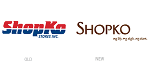
The old Shopko brand, if anything, evoked Wal-Mart’s “Buy American” promotional campaign of the 1980s and 1990s (back when Wal-Mart actually bought and sold products that were made in America) through its patriotic use of red, white and blue color scheme. Although dissected into two halves by a white rule, the logotype was bold, distinct, and had some personality to it through the curved serifs. But, while graphically effective, the old logo just sent the wrong message about the type of goods sold at Shopko.
Because Shopko is more than just a discount superstore, featuring an in-store pharmacy and optical shop for busy families, the new identity needed to be more sophisticated and reflect more of its customers’ lifestyles. Under the supervision of Jack Mullen, Shopko’s new Senior Vice President of Marketing, the new brand has been radically overhauled from head to toe, with the help of Columbus, Ohio-based Chute Gerdeman Retail to design the logo as well as the stores — or, at least, a prototype store.
Set in all caps, the name is harder to read at first glance than its predecessor, particularly since the K is no longer set to the same height as the S. The letterforms themselves are too thin, while the cutesy terminals on the P and leg of the K are a little too much. Kerning between the ko is not consistent with the rest of the word, and the O’s appear to be tilted the wrong way. Simply put, the logo reminds me more of a trendy Asian restaurant than that of a department store. Despite the logo, the other elements of the Shopko re-brand appear to be a revolutionary improvement (based solely on the web site, as there aren’t any stores in my neck of the woods), and the manly, “Buy American”, big-box, discount superstore image has been softened to reflect a more feminine aesthetic… based on the previous, this is quite a makeover.
—Ryan Hembree, principal/creative director (originally posted on Underconsideration.com/BrandNew)