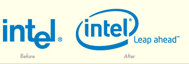
In early January, Intel introduced a new brand mark and tagline to coincide with the announcement of Intel-based Apple Macintosh computers. According to the press release, the new brand was described as an evolution that “will allow Intel to be better recognized for [its] contributions, establish a stronger emotional connection with [its] audiences, and strengthen [its] overall position in the marketplace.”
Changing a brand mark that is one of the most recognizable in the world seems like faulty logic to this critic. The reason for the update probably seemed like a good idea at the time; after all, Intel has had not just one, but two highly successful brands. The original Intel logo, introduced in 1969, featured a dropped “e,” resembling an electronic circuit. In 1991, the “Intel Inside” identity made its debut, appearing as stickers on the outside of millions of computers. Additionally, an unmistakable three-note tone identified the brand audibly in television and radio commercials.
 The new Intel identity attempts to solve the problem of having two highly effective brands, which in the case of a monolithic brand is when both become diluted or even over shadowed by the other’s success. Intel’s solution is to merge the two identities together by combining a futuristic-looking, sans serif typeface with a swoosh encircling it. The end result is an identity that could easily represent any technology-oriented company. And the new tagline, “Leap Ahead,” sounds like it is more applicable to the educational toy maker Leap Frog®.
Has Intel achieved its goal of bringing their identity to is next logical evolution? Does the new mark truly say anything about the company and what they do? In my opinion, the answer is a resounding “no.” It appears as though upper management didn’t have the courage to make a decision between two unique and memorable brands, and in trying to combine the most successful qualities of each, further diluted and weakened their brand image in the mind of consumers.
By: Ryan Hembree