Late last year, Coca Cola pulled their white “polar bear” cans from the market after only a couple of weeks and after a tremendous backlash from retailers and consumers. The white and silver cans, featuring silhouette polar bears, were supposed to remain on store shelves throughout the holiday season and raise awareness of and promote the protection of arctic habitats.
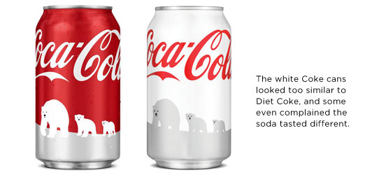 The off-color cans received a lot of attention, but for all the wrong reasons. The white polar bear Coke cans were too similar in appearance to the silver cans of Diet Coke. Retailers and customers were confused by the change from the traditional red, and had trouble finding the regular formula Coke. Some even complained that the taste of the soda was different—all because of the color of the can! It was arguably one of the worst missteps by the infamous brand in almost thirty years.
So how important is your brand’s color? The answer, as evidenced by Coke’s folly, is: Very Important. Color is a powerful signifier of a brand. When customers visually scan store shelves, they look first at color clues, then at shapes, and finally at the label or name of the brand.
The off-color cans received a lot of attention, but for all the wrong reasons. The white polar bear Coke cans were too similar in appearance to the silver cans of Diet Coke. Retailers and customers were confused by the change from the traditional red, and had trouble finding the regular formula Coke. Some even complained that the taste of the soda was different—all because of the color of the can! It was arguably one of the worst missteps by the infamous brand in almost thirty years.
So how important is your brand’s color? The answer, as evidenced by Coke’s folly, is: Very Important. Color is a powerful signifier of a brand. When customers visually scan store shelves, they look first at color clues, then at shapes, and finally at the label or name of the brand.
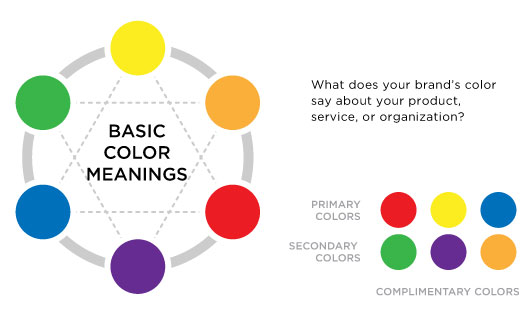 Red is the most passionate color, and tends to excite and get adrenaline pumping through the body. It is associated with both love and anger; it can mean good luck; or represent lust, danger, and aggression.
Blue is the most popular color, and also the most widely specified color in corporate identity programs. It symbolizes serenity and tranquility, the sky or ocean, and has a calming effect if used in moderation. Blue is often associated with things that are cold, as well as quality and expertise.
Yellow is the most luminous color with the highest visibility. It is the most cheerful color, representing the sun. If used too much, it makes people more irritable. Yellow has also become synonymous with greed and cowardliness.
Green is a very relaxing color associated with growth and prosperity, as well as health and wellness. It can also suggest envy and jealousy.
Orange is suggestive of fire and good things to eat. It is the most edible color, which explains why many fast foods chains use it as part of their color scheme.
Purple is associated with both royalty and spirituality because in ancient times, only emperors or kings could afford garments made of purple dye. Naturally occurring Tyrian purple dye is extremely rare—it takes 9,000 mollusks from the Mediterranean Sea to yield 1g of purple dye.
By: Ryan Hembree, Principal | Brand and Creative Strategy, Indicia
Red is the most passionate color, and tends to excite and get adrenaline pumping through the body. It is associated with both love and anger; it can mean good luck; or represent lust, danger, and aggression.
Blue is the most popular color, and also the most widely specified color in corporate identity programs. It symbolizes serenity and tranquility, the sky or ocean, and has a calming effect if used in moderation. Blue is often associated with things that are cold, as well as quality and expertise.
Yellow is the most luminous color with the highest visibility. It is the most cheerful color, representing the sun. If used too much, it makes people more irritable. Yellow has also become synonymous with greed and cowardliness.
Green is a very relaxing color associated with growth and prosperity, as well as health and wellness. It can also suggest envy and jealousy.
Orange is suggestive of fire and good things to eat. It is the most edible color, which explains why many fast foods chains use it as part of their color scheme.
Purple is associated with both royalty and spirituality because in ancient times, only emperors or kings could afford garments made of purple dye. Naturally occurring Tyrian purple dye is extremely rare—it takes 9,000 mollusks from the Mediterranean Sea to yield 1g of purple dye.
By: Ryan Hembree, Principal | Brand and Creative Strategy, Indicia