As we near the end of 2008, we look back on some of the brands that have taken shape. As a designer, it’s sometimes easy to make a snap judgment about a new brand identity shortly after its introduction, without giving it time to resonate with the audience. In this issue of re:marks, we look back at a brand that has had a year, or at least an entire season, in the market.
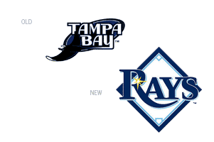
Major league baseball has always been an American tradition and a venue continually providing family-friendly fun. This fact must have, to some degree, impacted the Tampa Bay Rays’ move away from “Devil Rays,” and into a new brand focused on the best the state of Florida has to offer: sunshine. No doubt “devil” can be a good thing, especially when one speaks of eggs, but the franchise has more than struggled until 2008, spending much of their time in the AL East cellar. All that changed this past season when the new brand hit that stands and fans seemed more than accepting.
The new brand for The Rays is not a complete departure from the old, yet the use of the homonym for congruence seems a bit of a stretch. A vicious devil ray is not easily translated into a soft beam of light, and while there may be a subtle reference to a devil ray’s tail in the “R” extender, there seems to be more of a disconnect than a merger of identities. Similarities between the brands can also be seen in the color selection, namely the navy blue. However, the new logo ushered in several changes from its original form, the least of which is the use of a serif typeface and more obviously, the kitschy baseball diamond.
The Rays showcased not only a new brand this past season, but also a new team, in many respects. With better pitching and defense, a shot at the World Series didn’t seem like a complete fluke; a promising lineup paired with a new brand had the potential to be a winning combination. While it’s hard to rationalize an ALCS pennant due to a new logo, it’s undeniable that a new brand can do wonders for any company, even a down-and-out sports team. And while re-designing a franchise identity can be risky (costing lots of money), much money can be made from a good brand. In this respect, the Rays new brand can be considered successful—merchandise sales were up this year throughout MLB, but considerably more for the Rays. The conclusion one could draw is that the new brand is better than the old but not necessarily good design. The push for the new brand has even gone so far as to the Rays ownership issuing $1 fines to media members found using the former Devil Rays name (which reportedly goes to a Rays’ sponsored charity).
It will be interesting to see how the Rays continue to build on the brand they’ve established. With a generic typeface and lack of a fierce representative team mascot (it is unclear what animal would relate to rays of sun), the Rays may need yet another new identity in the near future. Perhaps the Rays can find a way to capitalize on their growing fan-base and unique geographical location to establish a relevant brand that will catapult the franchise into extra innings.
By: Kelly Campbell, designer