
As discussed in my review, the old Starbucks’ milk containers (the original re-packaging) incorporated a beautiful design that utilized whimsical farm-related icons as a subtle background pattern, with witty names for each of the flavors. The use of an old-fashioned milk bottle as the main graphic, conveying the idea of straight-from-the-farm freshness, was a clever approach to the problem of differentiating the product. However, in this case these unique milk packages were a classic example of the age-old conflict of “form versus function.” They were beautiful in form, but failed in terms of functionality—which was to communicate quickly what the product was and what it was supposed to taste like (looking more like an orange and blueberry smoothie or drink).
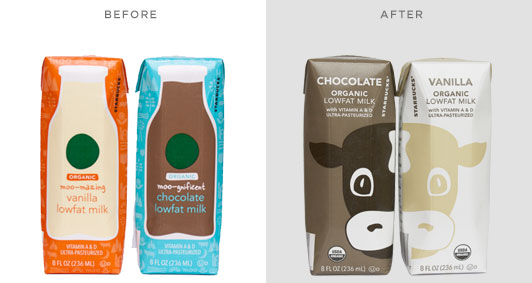
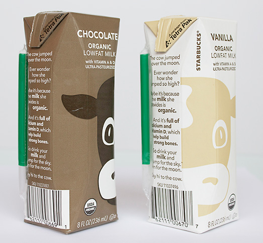
Although they are not as sophisticated in terms of design (concept- and execution-wise), the new milk cartons accomplish what the old ones did not—portraying the primary product attributes. Starbucks finally got the colors right; a muted, medium brown with darker accents for Chocolate Milk; and a white pack with beige accents for Vanilla Milk. When placed side-by-side, the two flavors of milk come together to form a friendly, cartoonish cow face. This sense of playfulness and discovery enhances the overall design.
The new Starbucks milk packaging succeeds in many ways where the old ones failed. They are simple yet effective, and when placed next to other similar products would definitely stand out. Their fun graphics and colors appeal to younger audiences such as children, who have probably been dragged into Starbucks kicking and screaming by their parents who have to have their caffeine fix.
By: Ryan Hembree, Principal | Brand and Creative Strategy