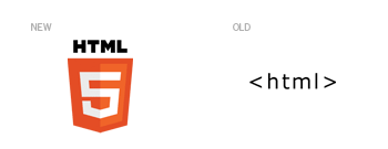
Recently the World Wide Web Consortium (W3C) announced its branding of a new technological buzzword—HTML5. HTML5 is the newest markup for website building, meaning it is the newest code version that gives websites structure. It touts the ability to build stronger, richer web applications without the use of Flash.
It may seem a little strange to be branding a publicly available, open source markup language, but the W3C doesn’t see it that way. None of HTML5’s predecessors (HTML 1, 2, 3 or 4) sported an official logo. So I have to ask, why is HTML5 worthy? As the most recent update since 1997, HTML5 adds many new features and streamlines functionality to render add-ons, rather than using plug-ins like Flash, Silverlight and Java, thus making your computer work less and deliver a better user experience. So, needless to say, HTML5 is a big deal.
The logo is simple, powerful and bold. It’s personality seems to belong somewhere between a new tractor trailer brand and a superhero badge. It is progressively iconic, and will work at almost any size, which is very important on the web. The crispness is refreshing, and the subtle dimensionality of the mark is quite nice. It is good to see some dimensionality that doesn’t use the cliché web 2.0 glassy look. Designed by Ocupop, they say it “follows very strict geometric rules providing an incredibly adaptable yet stable and stylish identity.”
Aesthetically, the shape of the logo lends itself to a web application, where it might be displayed as a badge of honor, visually similar to a coat of arms or crest. Something that seems to be quite important for users to know that a website is built using HTML5. And even if it is a little out of the norm for an open web platform to have a logo and brand, it works purely for uniformity of recognition. You can’t buy anything, you don’t call a phone number, but you can download various logo formats (including vector) of the logo for use under the Creative Commons 3.0. It’s a non-traditional way to brand.
All in all, the logo works well–even if it is a brand for a publicly available markup language. It doesn’t try too hard to be noticed, while at the same time demanding attention due to its visual strength. But wait, there is one problem—where is the ‘.1’ going to go when the upgrade is issued?
Justin Leatherman, Art Director