On September 1st, Google unveiled a new brand identity for its family of products and services. You may not have noticed, since the changes are relatively subtle, but for brand geeks like me, however, Google’s new brand is big news.
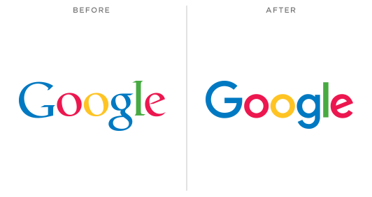
The new Google logo has been updated with a modern sans-serif typeface that is more clean and professional looking. The essence of the logo is the same… it utilizes the same color scheme, and when used for different products, the same recognizable icons. On first glance, it might be easy to miss the changes; after all, you use their search and communication tools to find information you are looking for, not paying attention to the logo. In this way, the new brand is not too distracting.
![]() Where the new Google brand becomes more apparent is in its application to the various products and services offered. GoogleMaps is probably the application that I use most behind search, and gone is the lowercase “g” that signified it. Replacing it is a much stronger and bolder “G” that is more pronounced, especially in the icon form.
Where the new Google brand becomes more apparent is in its application to the various products and services offered. GoogleMaps is probably the application that I use most behind search, and gone is the lowercase “g” that signified it. Replacing it is a much stronger and bolder “G” that is more pronounced, especially in the icon form.
While reaction to the new logo family has been mixed (an article by Sarah Larson in the New Yorker pans it as being untrustworthy and inauthentic), I for one think that it is a smart move. The reason why is simple: consistency of the brand across all media and applications.
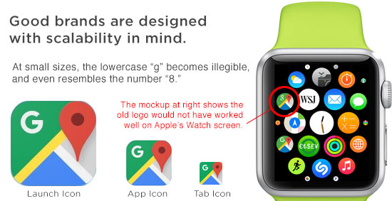
As we wear more smartwatches and other wearable devices with smaller and smaller screens, the old serif-based logo doesn’t work as well as the new uppercase “G.” And this fact, according to Google’s official blog, is exactly why they made the change:
“These days, people interact with Google products across many different platforms, apps and devices—sometimes all in a single day.…[and the new logo] reflects this reality and shows you when the Google magic is working for you, even on the tiniest screens.”
Google did not undertake a rebrand lightly. It was not because they felt like it was time for a change, or that they felt it was out of date. It was the result of the direction in which business is heading…and that path leads to smaller and more prevalent screens. The brand must work not only on desktop computers, tablets, and phones, but soon it will need to work in much smaller applications as well. The new Google brand is able to do just that.
By: Ryan Hembree, Principal | Brand & Creative Strategy