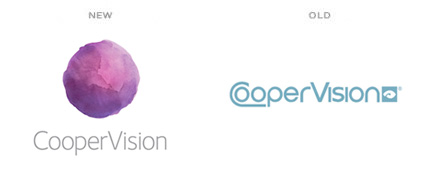
Today, according to the National Eye Institute, about half of all Americans over the age of 19 have poor vision, myself included. CooperVision has been my brand of choice for contact lenses for over 10 years. Although they haven’t enjoyed the mainstream popularity of brands like Acuvue or Bausch + Lomb, they have maintained a high reputation with optometrists and eye care professionals alike. This March, CooperVision introduced a new brand identity designed by the global agency, Siegel+Gale. The new logo certainly draws more attention and flaunts significantly better typography. However, at first glance, I found myself questioning the head of cabbage floating above the logotype.
After exploring the various brand elements, the meaning behind the logomark became more apparent. Although the attempt at creating a watercolored contact lens was a far fetched idea, the use of watercolor throughout the website, advertisements, and collateral made all the difference. The brand utilizes a painting and illustration style using bright hues and playful themes, which has a very personable and relatable feel. Diversifying with six different colors for the logomark, each “lens” is painted differently, giving a slightly different appearance to each mark. This casual uniqueness seems to subliminally show the confidence and swagger with which the brand lives.
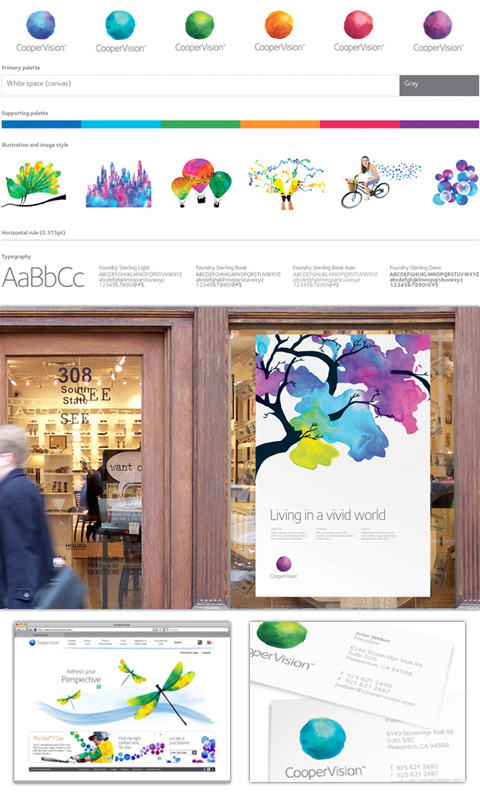
This is a great example of how CooperVision’s brand experience feeds off of every element involved. If the logo had been created with no supporting illustration or theme, using only photographs or simply typography, the rebrand would probably be negatively accepted. The logo could have been criticized for being remotely reminiscent of a contact lens, looking more like a rock or some type of vegetation– instead, Siegel + Gale created a bold brand with an idea that will surely be noticed. The bright colors, combined with a handmade aesthetic, leaves little to dislike.
“Overall, the system is designed to capture the vividness that exists in the everyday world, be as visually refreshing as CooperVision’s refreshing way of partnering with practitioners, while also bringing global consistency to a visually fragmented organization and establishing CooperVision as a clear masterbrand.”
Siegel + Gale Project Description
Overall, the logo is a stretch for CooperVision. The mark will be difficult to reproduce and surely not last as a timeless mark. However, what can be appreciated here is the strength of confidence and follow-through within the brand experience. This campaign will surely bring attention and recognition from many consumers, clearly putting CooperVision right back into focus.
By: Neil Ryan, senior designer