Just yesterday, while rifling through my daily pile of junk mail and local ads, I briefly paused at one flyer. I saw fish and rice, hushpuppies and even some grilled skewers of shrimp but could not determine what restaurant was being advertised. Upon closer examination I saw an unrecognizable logo advertising a company I was quite familiar with: Captain D’s. While I’m not a fan of fried fish, I’ve always been familiar with the logo. In fact, any member of my family could spot it mounted on a steel pole from any highway in the country. My curiosity piqued regarding this new logo and I wondered if Captain D’s was perhaps re-branding their entire chain, so I did a little research.
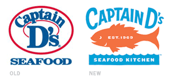
In August 2007, Captain D’s revealed their new brand. No longer marketing a kitschy fast food restaurant using bold colors like red and blue, D’s is now moving in a different direction altogether. With changes to the menu (additions of grilled seafood and pasta), a remodeling of their restaurants (now decorated with sophisticated graphics and beautiful hardwood floors) and the new look of D’s printed materials and website, it’s no wonder a completely different logo was implemented.
The logo itself is a successful tie in with the new brand experience. The subtle orange and light blue are uncharacteristic of fast food, and lend themselves to suggesting a finer seafood restaurant. This aligns exactly with the new changes made franchise-wide. The silhouetted fish hovers at the center of the mark, leaving no question as to what food is being offered at this business, while the older mark was far more ambiguous. Also, the words “seafood kitchen” are placed right below the fish, giving the restaurant a more sophisticated appeal.
The only real drawback to this new logo is a lack of a visual enclosure of the mark, something to separate it from the background. With a box insinuated from the squared edges of the blue waves and white, negative space defining the top corners, I feel the elements of the mark are a bit floaty. This was particularly obvious when I scanned the ad—each coupon seemed a bit cluttered and the logo was indistinguishable from other visual elements.
With an admitted dislike for fried fish, my new interest in the“Seafood Kitchen” could most likely be attributed to my attraction to the neutralized colors of the new brand and love of hardwood floors. And, between the new menu items at Captain D’s and the overall feel of the franchise, this restaurant may find themselves serving me more frequently.
By: Kelly Campbell, designer