
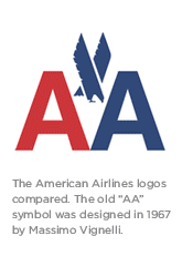
American Airlines has revealed a new brand identity from Futurebrand, replacing the work of Massimo Vignelli who in 1967 created the iconic logo that was utilized for over 40 years. Some believe this rebrand was unnecessary, however others believe American was ready for a transformation. To American Airlines, this brand signifies advancing and challenging themselves to renovate, innovate and place their customers at the center of everything they do.

American Airlines isn’t completely abandoning their proud past though—in fact, their rebrand is inspired by it. The goal of the rebrand project is to honor the airline’s “Uniquely American” heritage. According to American’s press release:
“Our new logo and livery are designed to reflect the passion for progress and the soaring spirit, which is uniquely American,” said Virasb Vahidi, American’s Chief Commercial Officer. “Our core colors — red, white and blue have been updated to reflect a more vibrant and welcoming spirit. The new tail, with stripes flying proudly, is a bold reflection of American’s origin and name. And our new flight symbol, an updated eagle, incorporates the many icons that people have come to associate with American, including the ‘A’ and the star.”
American Airlines’ new contemporary look symbolizes their plan for progress and improved customer service by incorporating colors and symbols that the public has come to connect with American. Their new logomark, also known as the Flight Symbol, contains a suggestion of an eagle, a star, and an “A,” as well as a patriotic color scheme. Together they exemplify a modernized version of the core elements of the company for the future of American and America. The Flight Symbol is shared with the airline name, which is set in a custom sans serif typeface named “American Sans.” American has changed, and they want everyone to know it.
 When I first saw the new Flight Symbol, I was instantly impressed by its polished and minimalistic qualities. Initially, I thought the mark was supposed to be peeling away, as if the airlines were emphasizing their timeliness and quick trips. The gradients and 3-D effects of the symbol are done tastefully, however the “American Sans” typeface seems to be an afterthought. The two certainly don’t relate to one another and the type doesn’t reflect the consideration and refinement demonstrated in the mark. Overall, I feel Futurebrand was successful in creating a fresh spin on the elements of the American Airlines brand that everyone has come to know and love.
I look forward to watching how Americans respond to American Airlines’ new look as the company continues to extend their updated identity across the brand’s platform. The fresh look is definitely first class, but it must be tied with a successful marketing strategy if American really wants to see the new brand take off.
By: Ashley Faubel, Designer